
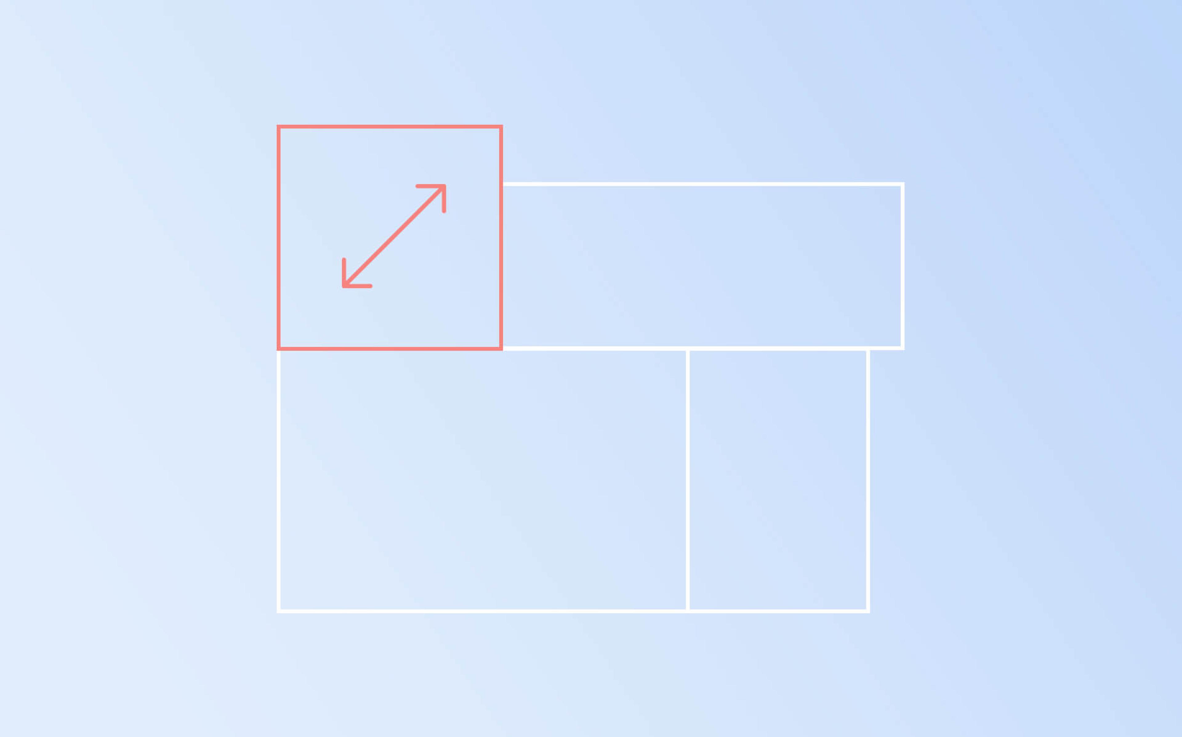
CSS Grid is a great feature! What I want to share here is a little tweak that should be used when working with grids and scalable contents. In a responsive context, a way to proportionally scale contents is making their dimensions to depend from a percentage of window's width, using vw units. If we don’t care about the overall grid element dimension (width and height), the enclosed cells could not be proportional, and will stretch over the two dimensions. There is no evidence of the problem with a square grid but it is instead evident with a rectangular one. If your goal is to maintain the internal cells with 1:1 proportion, even when the column and row counts do not match, this is a solution for you. The trick is to calculate the ratio of the grid's width, given its height (in vw units), number of rows and number of columns.
A South Park example
(Inspired by http://4x4pixels.blogspot.com)
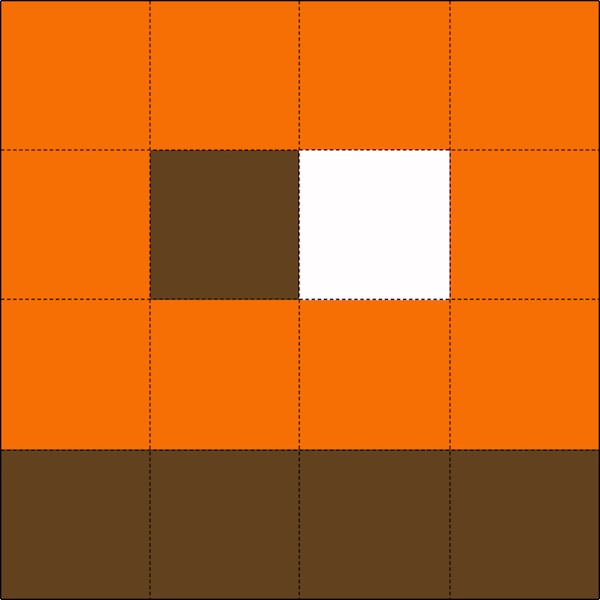
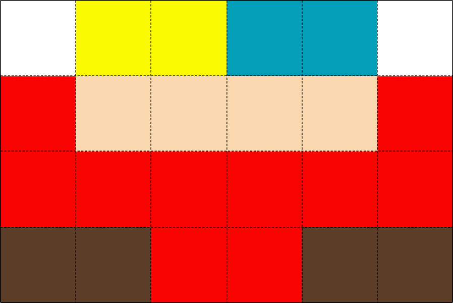
Kyle is a nice, square, CSS Grid guy... right click on him on the Pen, and turning on the inspector you'll see it has a 4x4 grid layout..
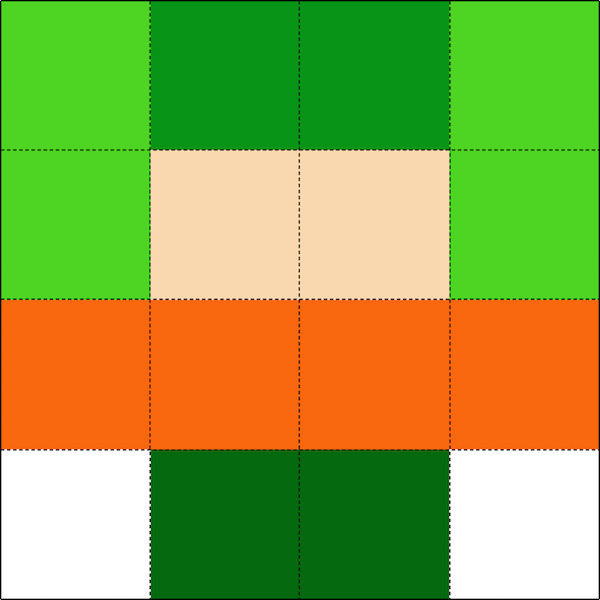
Also check he shares his dimensions along with his friends Stan and Kenny.
I'm big boned!
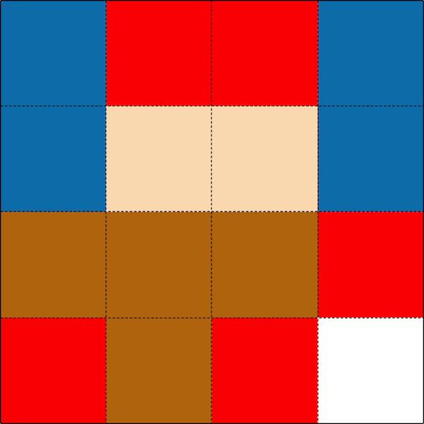
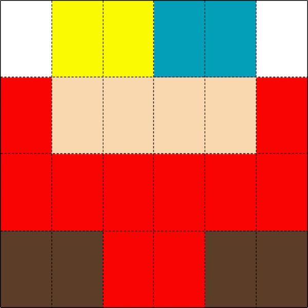
Ah! There’s also Cartman! …but, wait a second… he should be a bit wider than the others! What happened to him? Did he go on a diet? Let’s turn on the inspector…
We can see that all these CSS Grid guys have a 4x4 layout, but Cartman has 6X4. His grid cells are not 1:1. Since the container's width equals its height, the cells look rectangular because there are more columns than rows in Eric's body :)
We are going to introduce a mixin that solves the problem by calculating the width ratio based on the height and the number of columns/rows.
@mixin scalable-grid($columns, $rows, $height) {
	width: $columns * $height / $rows;
	display: grid;
	grid-gap: 0;
	grid-template-columns: repeat($columns, minmax(1%, 1fr));
	grid-template-rows: repeat($rows, minmax(1%, 1fr));
}
This way the cells' aspect ratio will always be 1:1.
Ha-ha! Now I recognize you little bastard!
A close friend of everybody
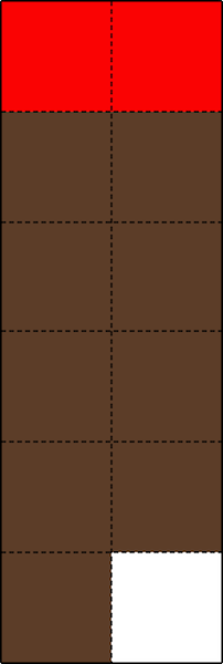
Of course, this is also valid when there are more rows than columns, like when it’s Christmas and Mr.Hanky 2X6 comes…
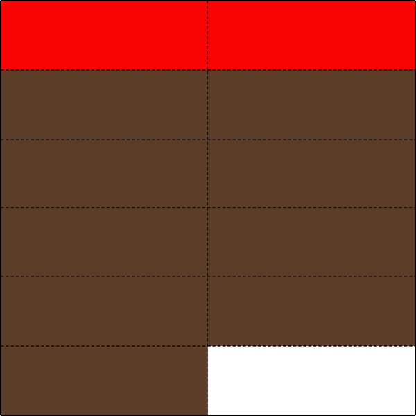
Better maintain his proportions with our mixin :D
And now you can kill Kenny :)
Usefulness?
Besides this (funny?) example, I found this approach useful in my front-end experience anytime I needed to show images inside a grid — a very complex rectangular grid with some empty cells — but I wanted to keep the aspect ratio of every cell 1:1 (with some of the images spanning over multiple cells), and also get the CSS grid to be fully responsive.